Block Three has properly begun now with not one but two projects on the go simultaneously which is giving me slight cause for concern. The Door Project which I'm about to discuss, I'm super confident with as it's definitely within my comfort zone but the dreaded Graded Unit is not. Anyway, more on that later when I actually know what I'm doing - on with the show!
Last year, we had to make this scale model of a door which, for our first major project on the course was a big ask!
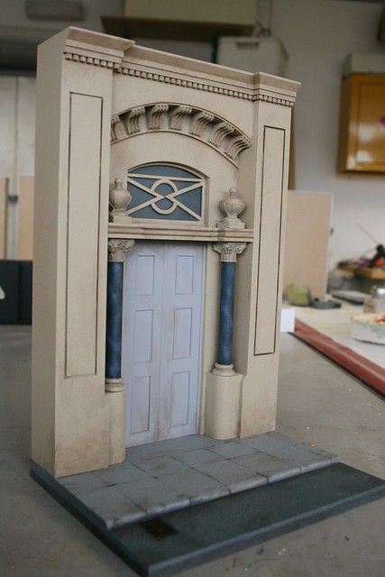
While it worked out really well and everyone was really pleased with it, we all kinda wished we could have been able to choose our own door to make. Luckily for us, this year we were granted that choice and so, with the following stipulations...
'For this project we have been asked to research, plan and then produce a scale model of a doorway using one of the given themes of either ‘A Glasgow Building, ‘A prominent building from around the world’ or ‘a doorway from a TV or movie production’.
The final models are to be approximately A4 in size and finished to a very high standard. They will be painted in a plain monochrome colour – probably grey.
Once a suitable example from each theme has been chosen, we are to present our findings in a sketchbook, using photographs and text to describe and explore the history and design behind each one. This aspect of the project must be a minimum of nine pages long - three pages for each door – and include references to all source material referred to.
After consulting with our tutor regarding the final choice of doorway to create, we will form a PowerPoint presentation around it, describing in detail the history, construction and context of the doorway with reference photographs and as much additional information as can be gathered. This is to have a minimum of 1,500 words. This will then be presented to the class.
Next on the agenda is the production plan which will include annotated sketches, a 3D mock-up in card, working drawings and a minimum of two sample finishes.
Finally, the model will be created over a period of weeks and affixed to a specially made panel suitable for display.'
...we began to plan.
I had a good think and did a lot of research but finally narrowed it down to an iconic and striking 'doorway' from the Tim Burton film 'Sleepy Hollow'
THE TREE OF THE DEAD
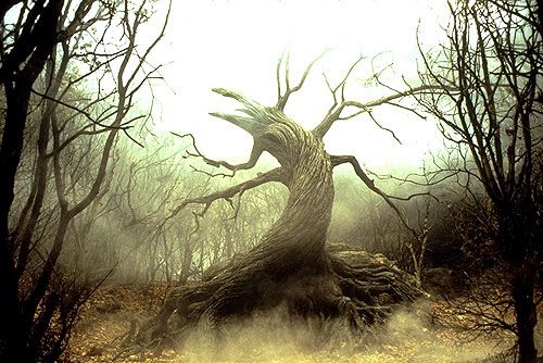
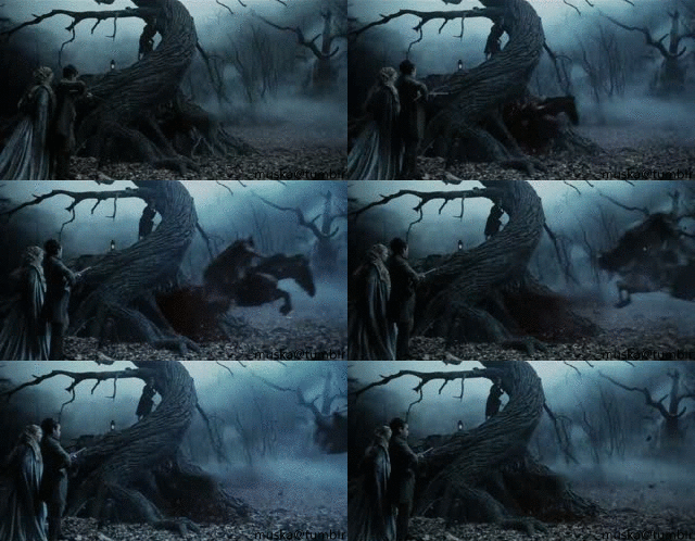
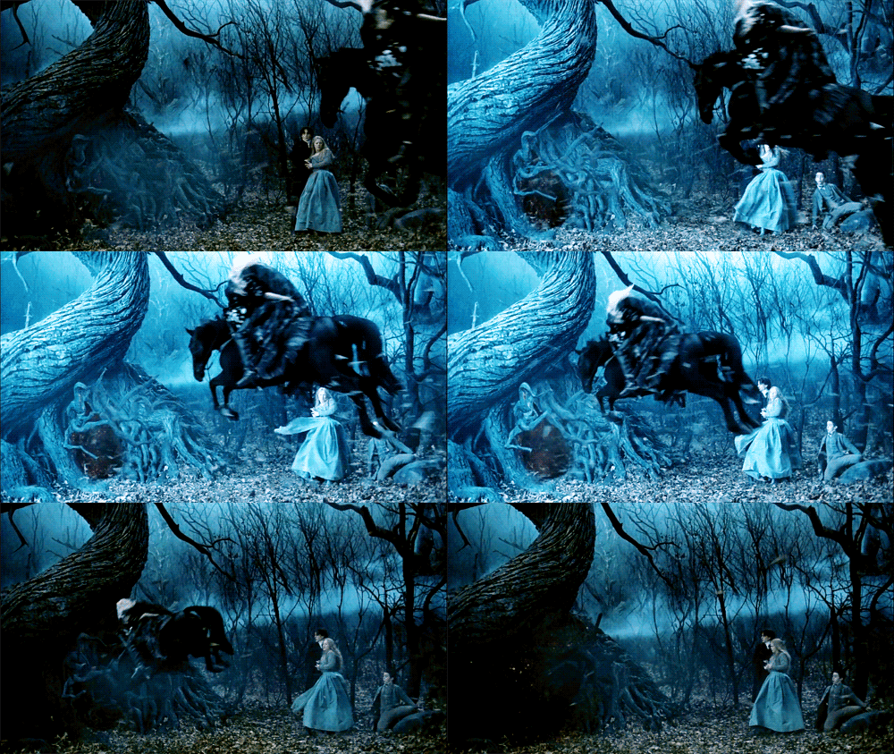
The Tree of the Dead is an integral part of the plot to the 1999 Tim Burton production in which a ruthless and headless horseman wreaks havoc in the small hamlet of the titular name.
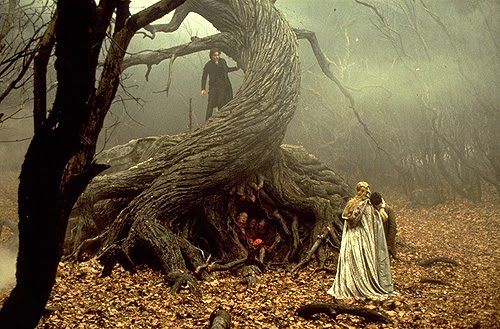
The film was loosely based on Washington Irving’s ‘The Legend of Sleepy Hollow’ and many liberties were taken with the plot, meaning that the tree in question exists only within the film version. In the film, the Horseman is being manipulated by the villain, who uses the undead spirit's missing head as a means of control. When he isn’t being sent out to behead those who his master wishes dead, he and his horse dwell in either the spirit world or Hell. (the film isn’t specific.) This gateway to the underworld lies through a hellish portal within the Tree of the Dead and it is through this that the Horseman emerges several times throughout the film.
I absolutely loved the design of the tree and how raw and sculptural it all is - all in all, it is a very striking thing, and, as described in the film’s script:
‘Its branches reach far and wide, knotted and gross, like agony captured in wood sculpture’
(which, let's face it, is a pretty awesome quote)
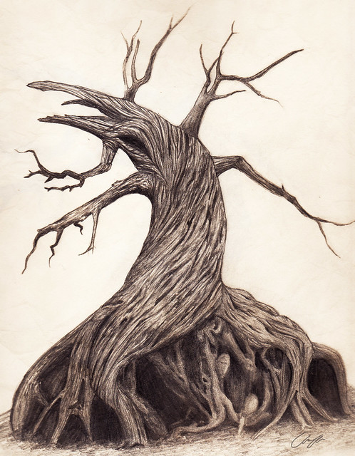
It was difficult, nigh impossible to find reference images of the tree in it's entirety as it is ultimately blocked by camera angles or by the actors in every scene it is in so I had to draw from several screenshots at once.
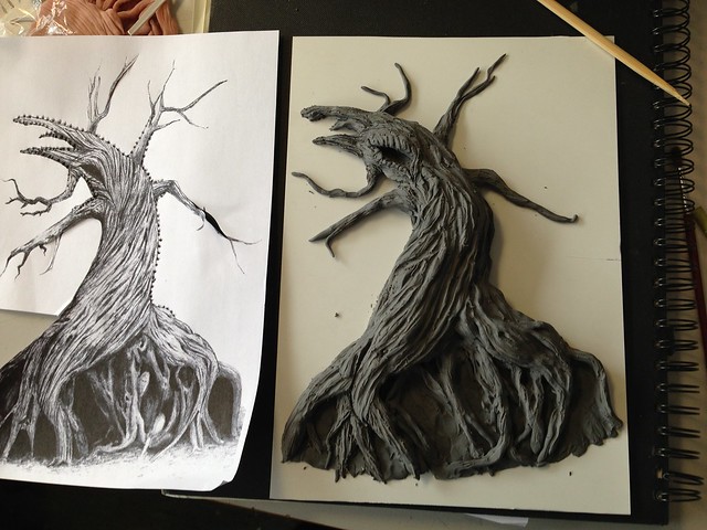
This became my working drawing and after being scanned and enlarged slightly so it would fit the A4 maximum neatly, I printed out a couple of copies to use.
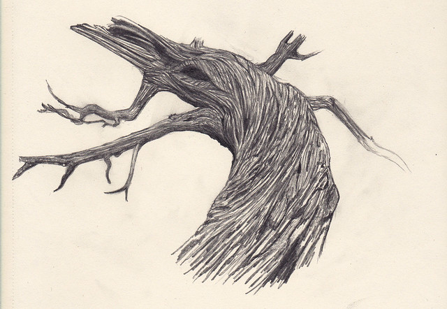
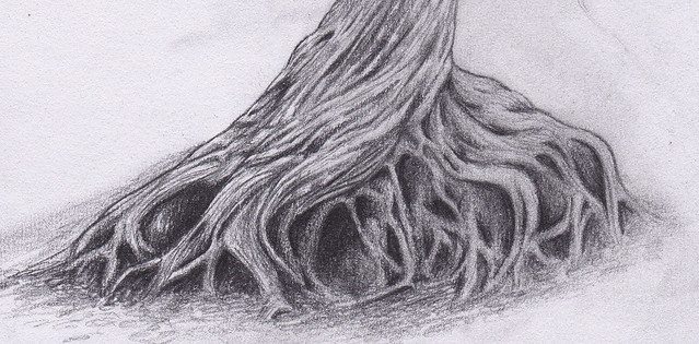
Detailed sketches of the other parts were required too and I became less than enamoured with it's insanely complicated root system within a matter of hours.
I also did a couple of sample finish pieces in sculpey, this being one of them.
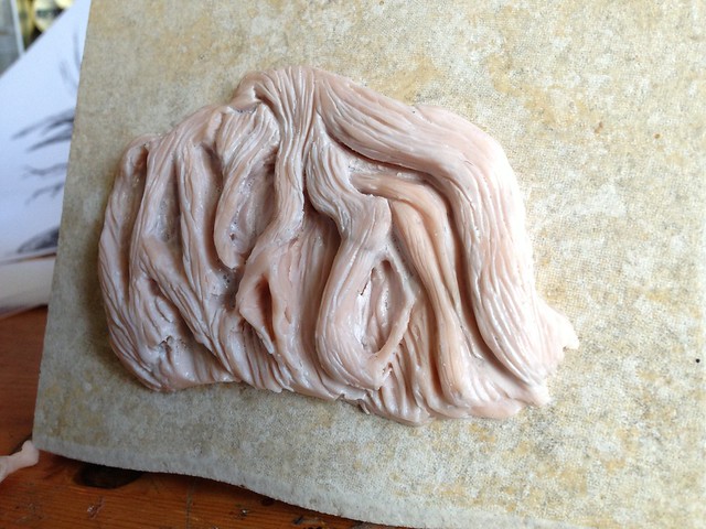
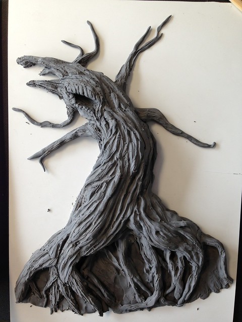
Those had all been done within the last couple of weeks but today was the first time I was able to get round to starting the 3D mockup. I decided to go for plasticine as I absolutely love using it and it's so easy to work with - and quick too. I spent the whole morning on it and ended up with this by lunchtime. I'd forgotten all my usual sculpting tools so this was worked on with an old chopstick and the end of a paintbrush.
I'm really rather pleased and apparently so was Simon as he reckons that I should work on it until it is perfect, then cast it so I can have a resin version as my final piece. I like that idea for two reasons.
1. I don't have to start it from scratch again and...
2. I can do multiple copies and paint one to look like the actual tree with loads of weathering and blood and gore etc! Woot!
I've got the whole day to work on it tomorrow so here's hoping I make as much progress then! :D
EG out!

Hey, again a really awesome project! I already love the drawing and the sculpted version is coming along so well! *cheers you on* I am very much looking forward to seeing the finished versions.
ReplyDelete